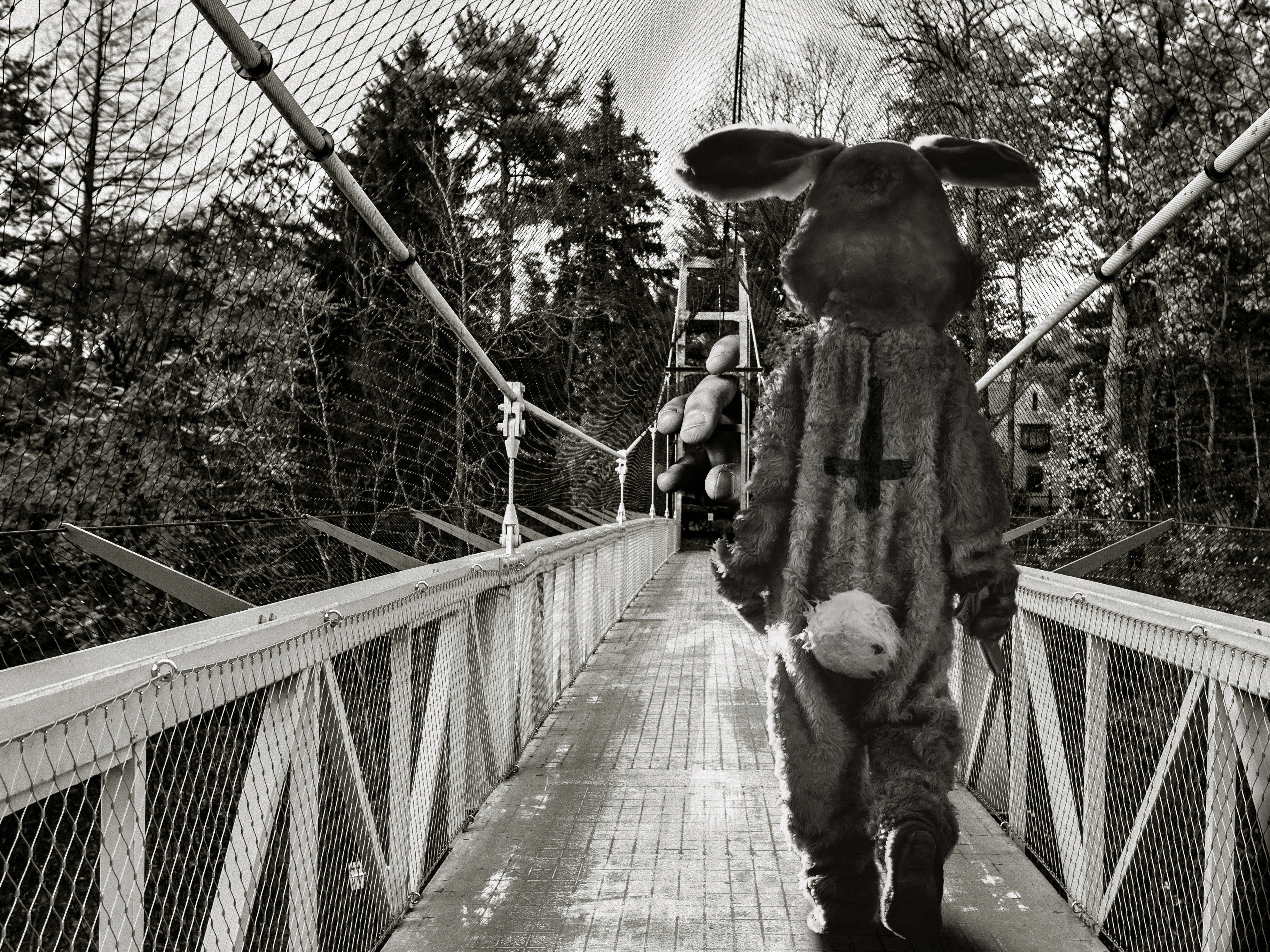
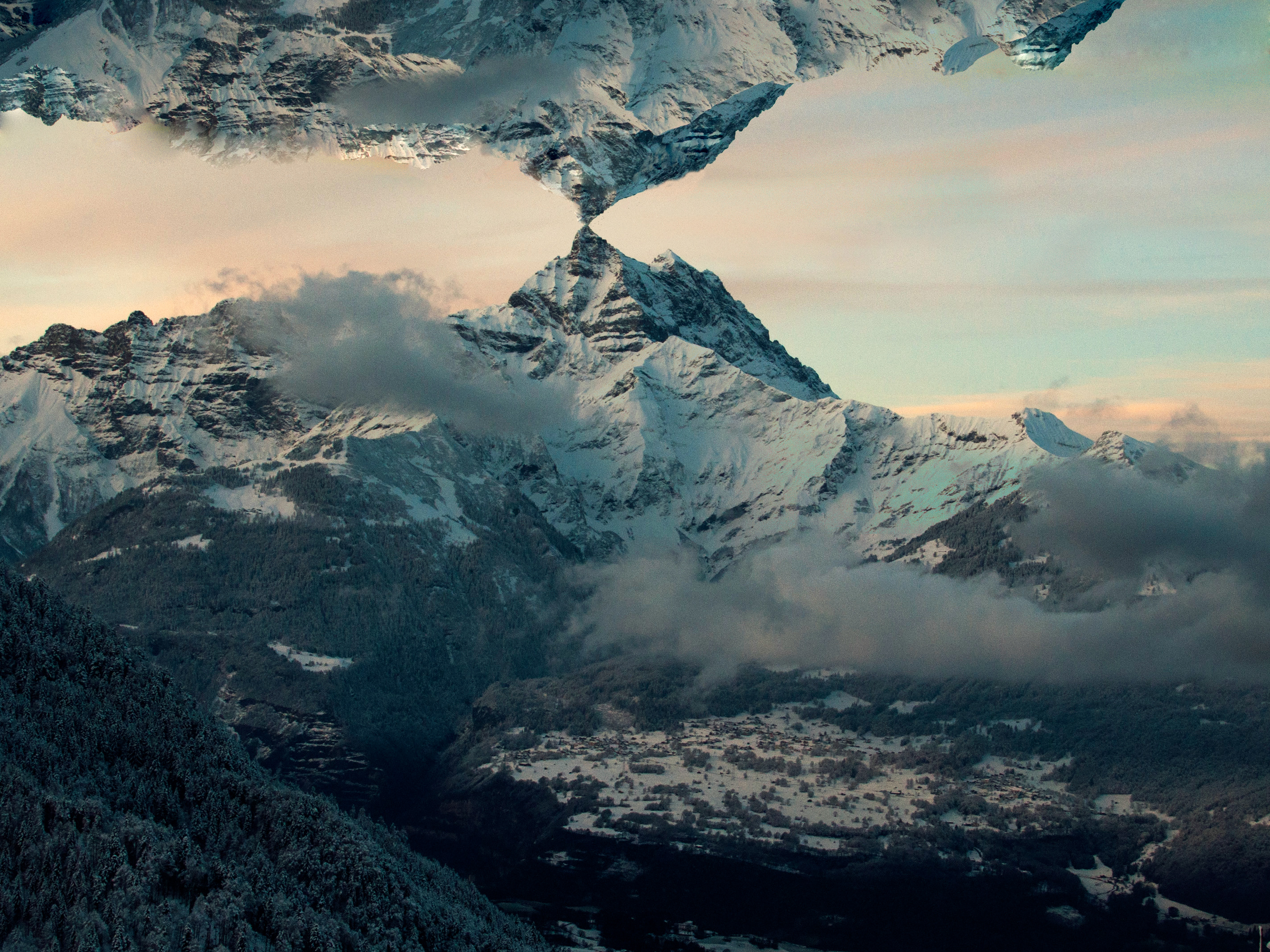
This was the big thing.
After doing three mixtapes it was time for the debut album to arrive. Ben worked on it for a year, trying to perfect it as best as he could see fit. It was important to make it exactly how he wanted it to sound and be felt, with no compromises. It's title, "Before the A.M." is referencing Ben's internal rule with either making music, or staying up late... never after midnight.
The first version of the artwork.
What you see here is the first version of the cover art I designed for the album.
In coming up with the concept of the album we needn't look no further than the album's title. As its title is "Before the A.M." it signifies the time of day where the evening meets the night. A solid idea, that would be used throughout, was a picture, and the aesthetic of a sunset near dusk.
I used this cozy picture, made it look distressed, and decided to write the album's title with a pencil on the bottom of the artwork, for fun. It was approved, and that's that.
Well...
After some time, as Ben was working on the album's sound and I saw/heard/felt the shaping of the music, I took a look at my artwork with a new set of eyes. To me it didn't do the coming album justice. Prior to making this artwork I'd been working on the artworks for Ben's mixtapes. And with that I felt this new artwork looked to much of a mixtape. This caused a stir within. I rarely doubt my work needlessly, but at that time I felt I'd really messed up. I decided to redo both the aesthetic of the album, as well as the artwork.
The biggest issue was that I had to make the album's artwork stand out from the rest of his catalogue. You should unconsciously recognize the artwork as an album, among his other releases.
I decided to experiment, trying things I haven't done with album arts before. A concept that appeared was that what if instead of the usual edge-to-edge picture in a 1 x 1 square, the photo was scaled down, and placed off-center to one of the edges? And that's how it came to be.
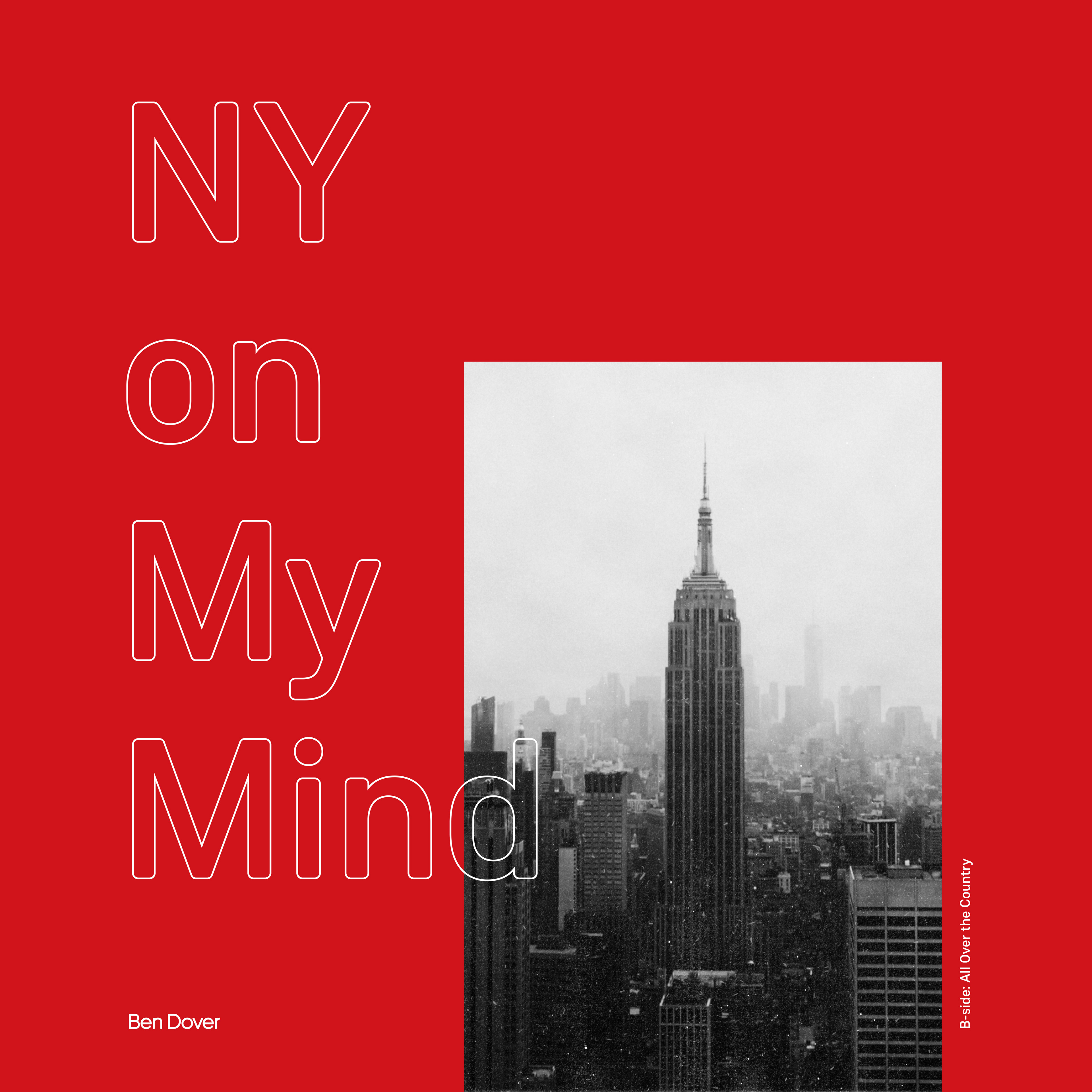
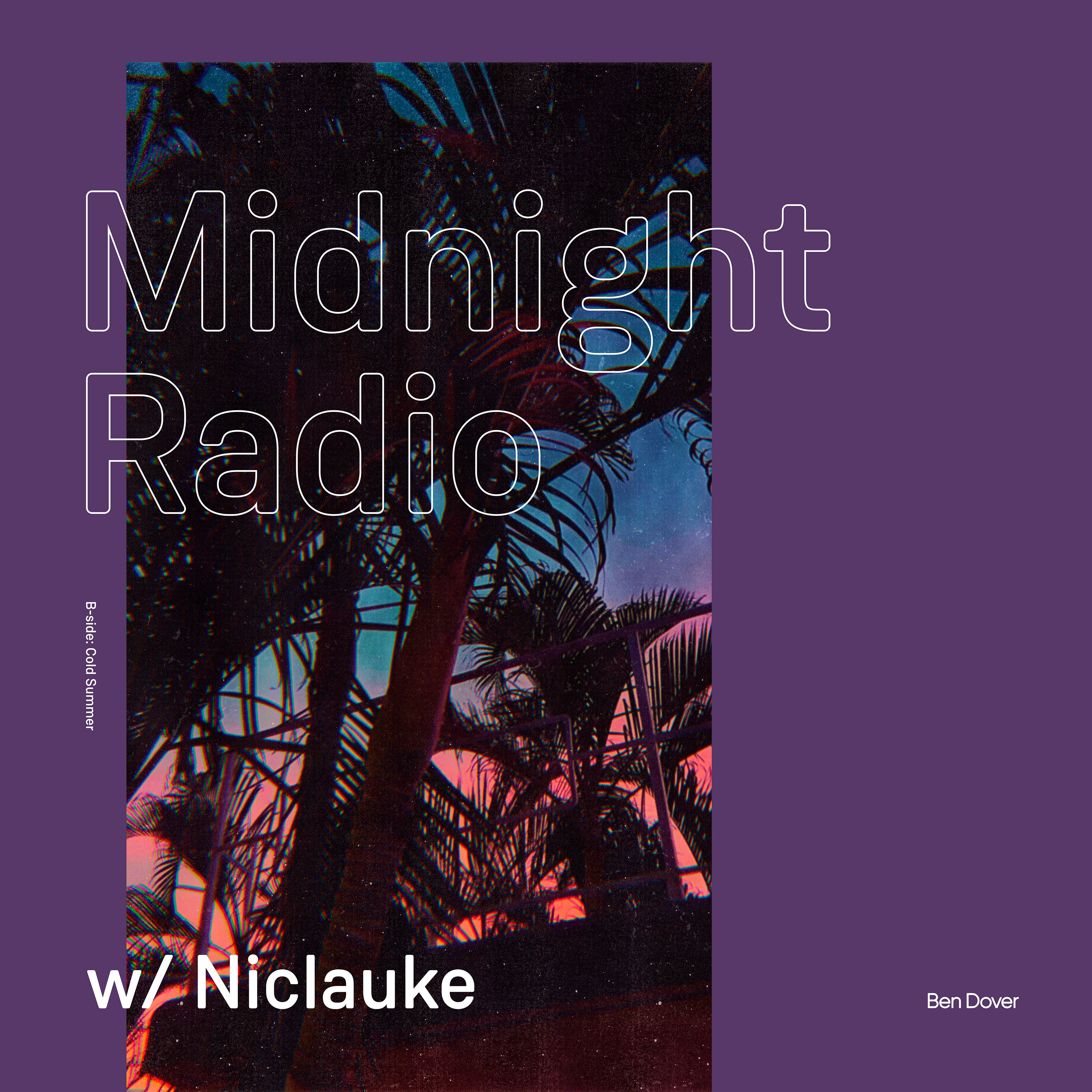
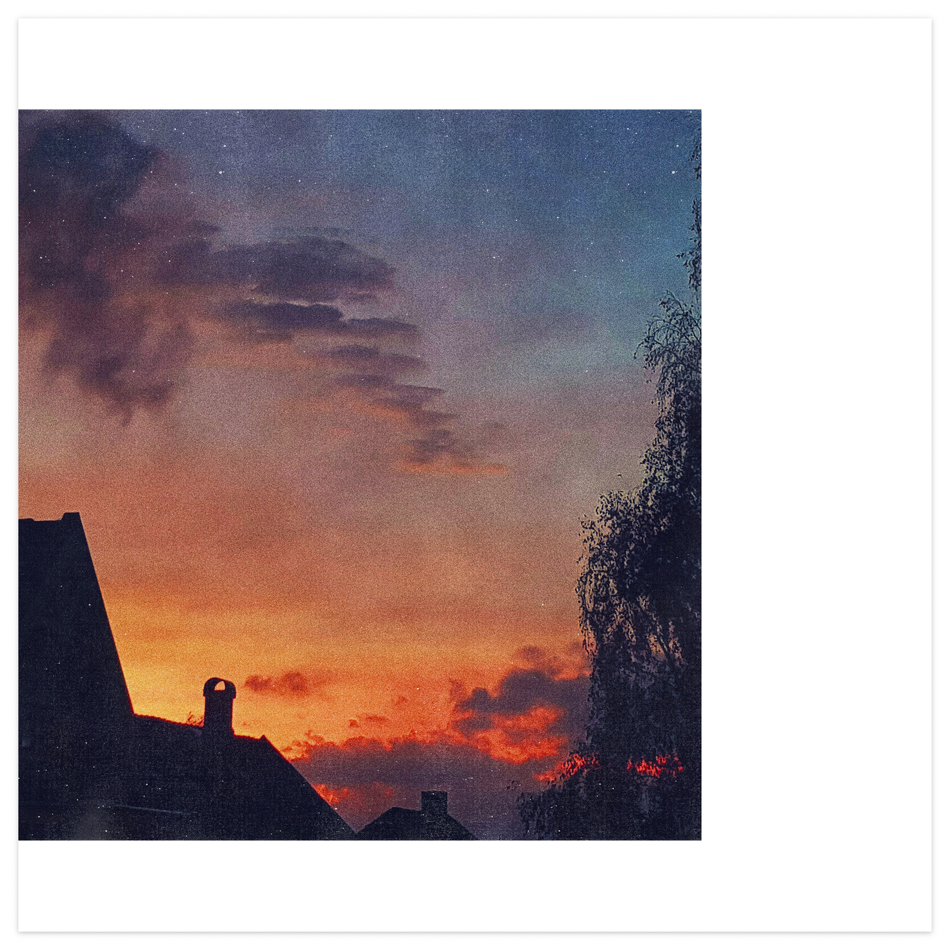
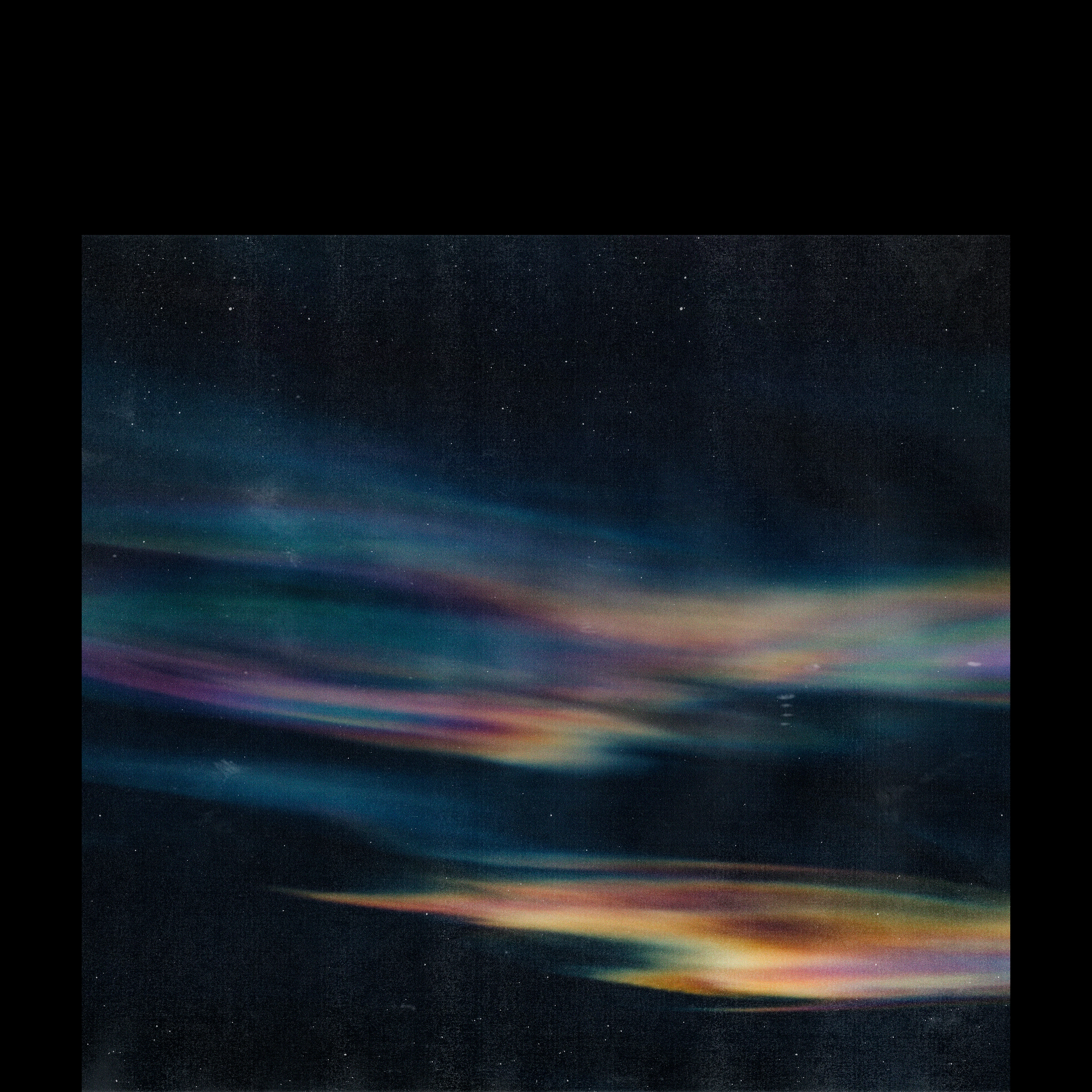
This new style was then applied to the additional artworks that belonged to the album.
With the singles we could experiment with type. And a playful use of colour was added. Where as the album's artwork used a plain white color as it's border, the singles got a red and purple border. Along with pictures that utilized the same off-center layout.
There was also to be an additional release, a bonus EP with leftover stuff from the album. It was affectively titled "After the P.M.". This signified that it was now the dead of night, to complement the title, the artwork featured colourful skies at night, in front of the black color of the night sky.
Credits:
All photos for the artworks by Kristoffer Hefe, with the exception of "After the P.M."
"After the P.M." photo by Jens Schanche.
I've also designed the rear album cover, and a digital booklet for this release. You can access those by buying the album through bandcamp, they'll follow as a download.
YOU CAN NOW BUY THESE ARTWORKS AS HIGH QUALITY POSTERS THROUGH MY ONLINE SHOP:
Links:
Apple Music/iTunes: https://apple.co/2IJtW2E
Tidal: https://bit.ly/2INfeaI
Google Play: https://bit.ly/2kovlNt
Amazon: https://amzn.to/2GONHQD
Bandcamp: https://bit.ly/2Kkgq2v
Tidal: https://bit.ly/2INfeaI
Google Play: https://bit.ly/2kovlNt
Amazon: https://amzn.to/2GONHQD
Bandcamp: https://bit.ly/2Kkgq2v

